Débora Malqui · Brand design
Four brands, from the first idea to real use.
Each case shows the final logo with its versions and uses, the idea behind it and the path that led there, with the tests of every step. They run from the most recent to the oldest.
2026 · Full identity
Medido
A consultancy that measures the marketing of small businesses in the United States and Israel, in English and Hebrew. The brand had to feel like a measuring instrument without drawing one.
- Logo
- Hebrew
- Palette
- Typography
- Guidelines
- Website
The idea
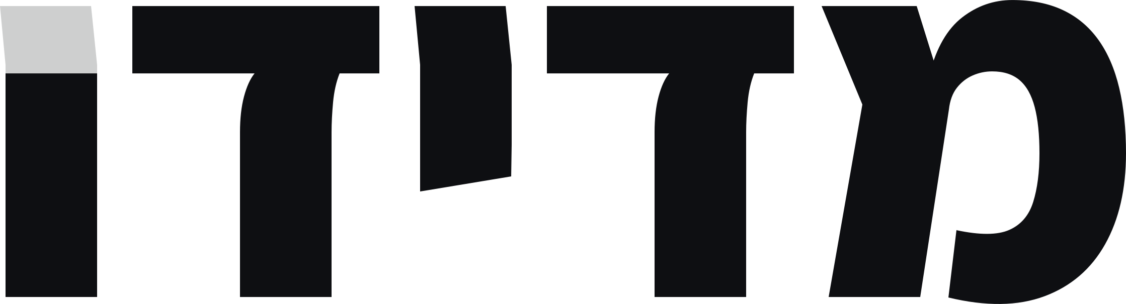
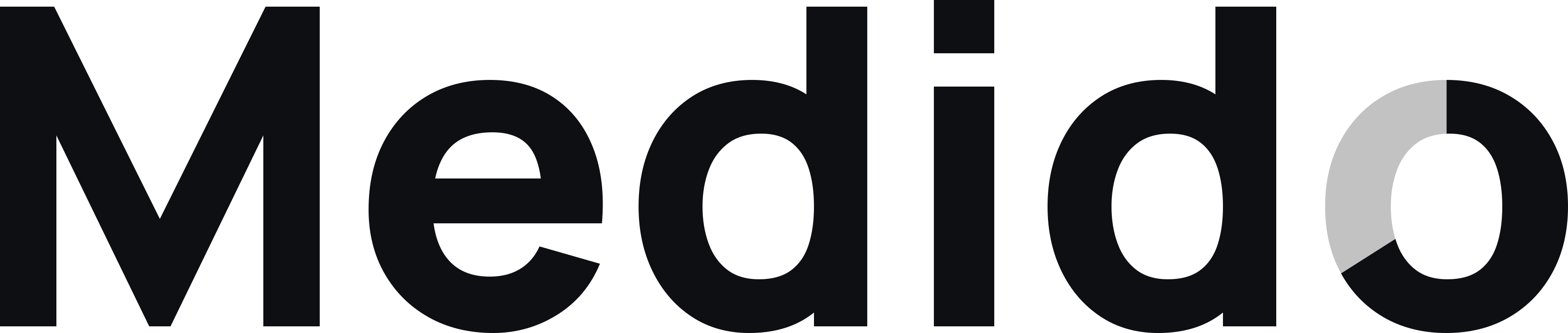
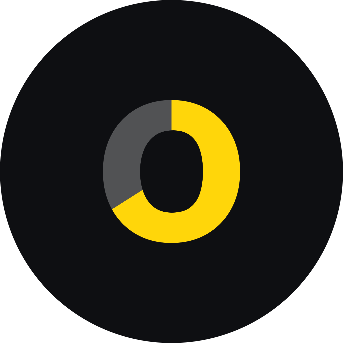
The name says what it does. The final o is a ring filled to 66 %, clockwise: a measurement that shows what is there and what is missing, which is the rule of the whole brand.
The ring's counter is identical to the counter of the d. In Hebrew, the final vav fills the same way, up to the top of the dalet. Yellow exists only on black or as a background behind black.
- Role
- Brand, guidelines and website design
- Deliverables
- Logo on three surfaces and in Hebrew, ring, favicon, avatar, delivery board, guidelines and website
- Status
- Logo closed and delivered
Path
Four directions, nine references
A board with four worlds (tape measure, ledger, instrument and topography), built from nine reference sites and the month's web design awards. The ledger base stayed, the report an accountant would sign, with the instrument's typography.
Six palettes
On that base I built six palettes, each applied to a sample report with its contrast calculated. None convinced yet.
The obvious was discarded
The ruler and the tape measure were left out because they say construction, not marketing. Then I tried five search symbols: the o as a magnifier, the name inside a search box, the first result, the answer and the click. Not those either.
Six marks made only of letters
I moved to marks without an icon: the full stop, the M as a chart, the highlighter, the block, the o that fills up and the slope. The fifth stayed.
The o as a ring
I measured the ring on the real o of twelve typefaces, with Hebrew in all of them, until it fit the word. Three finalists remained: Plus Jakarta Sans, Manrope and Schibsted Grotesk.
The real logo, in eight palettes
With the ring chosen, I converted the logo to real outlines and tested it in eight palettes, with the favicon, the avatar and the trust labels beside it.
Black and yellow, with the contrast calculated
I tried seven yellows. The calculation showed that yellow on white scores between 1.2 and 2.1, and on black between 8.9 and 16.6. Hence the rule: yellow goes on black or behind black, never as lettering on a light background.
Plus Jakarta versus Manrope
The two finalists, with the same yellow, the same ring and the same surfaces, side by side. Manrope 800 won, with more identity, and Assistant 800 for Hebrew.
Trained-eye adjustments
The counter of the o became that of the d. The ring settled at 66 %. In Hebrew, the cut of the vav lines up with a line of the dalet.
Delivery
Versions, ring, favicon and avatar, clear space, minimum sizes and what not to do, all on one board. The files are outlined, with no dependency on the font. Then came the guidelines and the website.
Versions

Uses
Specifications
- Black
#0E0F12 - Sun Yellow
#FFD60A13.6:1 on black - White
#FFFFFF - Support grey
#A7ADB88.5:1 on black
- Typography
- Manrope 800 for the logo and headings, Assistant 800 for Hebrew, JetBrains Mono for data.
- Clear space
- x is the height of the o. Clear on all four sides.
- Minimum size
- 72 px wide on screen (20 mm in print), 64 px in Hebrew. Below that, the ring alone.
- Colour rule
- Yellow only on black or as a background behind black. Never yellow lettering on a light background.
2026 · Initial identity for a podcast
El Salto
A weekly podcast with real stories of new olim, produced by La Casa TLV. I started from an existing logo, in blue and white, and read it before touching it.
- Logo
- Two proposals
- Typography
- Favicons
- Presentation
The idea
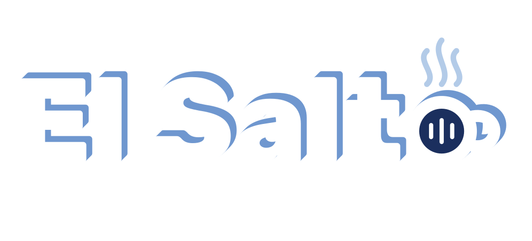
Aliyah means ascent, and to leap is to go up. That is why the logo's shadow now goes up and to the right, never down. What people already recognised stayed, the blue, the white and the name, and a nod to La Casa was added.
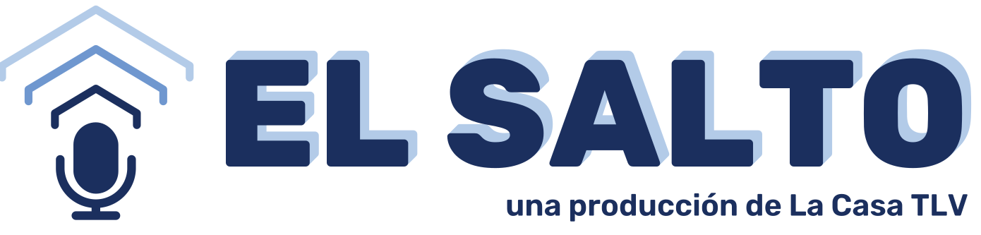
The team asked for closeness, authenticity and belonging, in the tone of a chat over coffee. Two proposals came out: B, a microphone under three house roofs, and C, the o turned into a coffee cup.
- Role
- Reading of the logo, exploration, design and presentation
- Deliverables
- Two final proposals, four SVGs, twelve favicons, applications board and presentation
- Status
- Proposals delivered, the team chooses
Path
Reading the logo I received
I read it in two layers, what it shows and what it says. Black capitals on navy sound institutional, the shadow falls while the name speaks of rising, and nothing hints that it is a podcast. Decision: the blue, the white, the name and the shadow stay, now pointing up. A nod to La Casa is added.
Fourteen typefaces
I tried fourteen families in capitals and lowercase, three of them with Hebrew. Rubik stayed: free, with Hebrew, several weights and an ExtraBold that holds the blue.
Three ideas for the mark
Three symbols for the microphone, B1 concentric, B2 broadcast and B3 microphone-house, each tested from large down to 16 px, on white and on blue.
The first compositions
The microphone-house and the cup stacked, horizontal and on a single line, with and without the La Casa line.
B2, from large to small
With B2 chosen, I tested it stacked, horizontal and as a round avatar, and the mark alone, flat, from large size down to the favicon.
Guides and alignment
The mark at cap height, with guide lines, and the cup aligned with the La Casa line on the left.
The weight of the cup
The cup with the line in four weights, from 400 to 700, and several rim thicknesses, until the handle stopped merging with the letter. Rubik's o did not work and I drew it to measure.
The O as a microphone
I tried making the O of SALTO the microphone, narrow and wide, in white and in blue. It was discarded.
B on one line, measured
The microphone sets the block: I tried five heights until it overshoots the capitals by the same amount above and below, with the La Casa line at the foot.
Symmetry, verified
The shoulders of the inner roof fall on the axis of the letters, and the microphone's oval ended up solid, with no lines inside.
Two proposals and favicons by size
Each option came in colour and reversed, with a fixed line, “a La Casa TLV production”. The favicons have their own drawing at 16, 32 and 64 px, with thicker strokes and less detail in the small ones.
Versions


Uses
Specifications
- Navy blue
#1B2F5Eapproximated from the logo received - Mid blue
#6F97CF - Light blue
#B3CBE8 - White
#FFFFFF
- Typography
- Rubik ExtraBold for the name, Rubik 600 for the line “a La Casa TLV production”, right-aligned and tight against the word.
- Shadow
- Only at large sizes and in print, always up and to the right. At small sizes, flat.
- Discarded
- The O as a microphone, a house-shaped microphone, roof-waves that clash with the T.
2026 · Personal brand
DiDí
The logo of my own portfolio. It existed only as a 380 × 193 px image. I rebuilt it as a vector by measuring every shape, adjusted it and turned it into a system.
- Vector logo
- One colour
- Favicon
- Motion
- Own typeface
The idea
DiDí reads without a typeface: two open Ds, with no stem, and two short bars, with an accent tilted at −50° that is the only diagonal and bends everything else. The pink D enters cut off from the edge: that cut is the logo's motion.
Five pastels of similar lightness, which read as a family. Di, Dí: two beats, the second with an accent, the way the name is said.
- Role
- Reconstruction, adjustment and brand system
- Deliverables
- Vector logo, one-colour light and dark, stacked, monogram, favicon, motion and two typefaces
- Status
- In use on this site
Path
A PNG as the only file
The logo existed only as a cropped 380 × 193 px image, with no vector and no design file. Before improving anything it had to be rebuilt.
Measuring instead of redrawing
I measured every shape by colour (centres, radii, thicknesses and the angle of the accent) until the vector matched the original by 95.4 %. That is the maximum possible: the rest is the anti-aliased edge of a pixel.
Six small adjustments
I corrected what a trained eye sees as construction noise: three thicknesses, two D sizes, three baselines, a different counter in each syllable and a clipped accent. I did not touch what makes it this logo: the angle, the cut and the five colours.
Backgrounds and contrast
I tested five backgrounds with the contrast calculated. The pastels pass 7:1 on charcoal, graphite and night blue. On light there is a version of the same family with more ink, and a one-colour version for signatures and stamps.
A D without a stem, in the letters too
I redrew the capital D of the site's typefaces without a stem, with the same construction as the logo. DiDi Sans, based on Figtree, and DiDi Mono, based on DM Mono, were born, both open-licensed. This page is set in them.
Specifications
- Pink
#E890CCaction - Light blue
#80ECECnavigation - Yellow
#DCD060attention - Blue
#70B4F4data - Green
#ACEC84correct - Night blue
#0F1B2Dsurface
- Typography
- DiDi Sans for headings and text, DiDi Mono for labels and data.
- Clear space
- x = 40 units, two strokes, 0.21 of the height. The cut D can bleed against the edge or keep the same x, never an in-between margin.
- Minimum size
- 120 px wide on screen (30 mm in print). Between 64 and 120 px only in navigation bars on charcoal. Below 64 px, the Di monogram.
- One colour
- Light (#F2F2F2) on charcoal, or dark on light.
2024 · Logo and brand for a festival
Red Española de Danzas Circulares
The network that brings together the people who dance circle dances in Spain, and its first festival, “Directo al corazón”, in Sant Feliu de Llobregat, Barcelona, in 2024.
- Symbol
- Festival logotype
- Brochure
- Social
- T-shirt
The idea
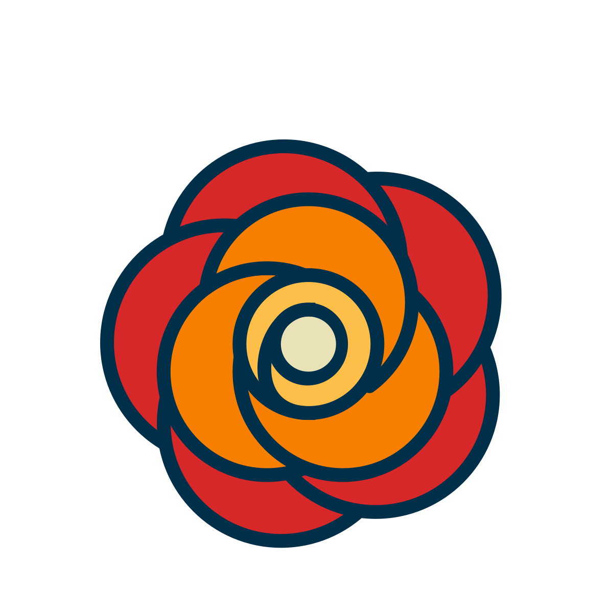
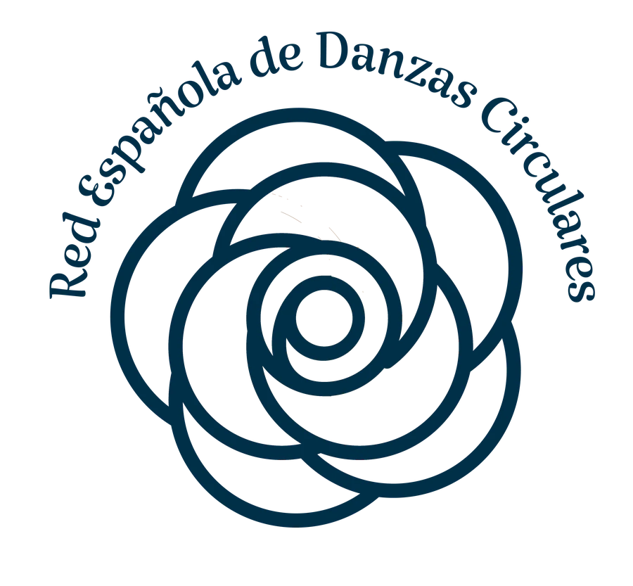
Circle dances are danced in a circle, and the brand tells it: petals turning into a spiral centre, like a circle of dancers. The flower is the carnation, the one associated with Spain, and the name surrounds it in an arc to close the circle.
The festival speaks more directly. “Directo al corazón” is written in an artistic brush lettering, in red, and the o of corazón becomes a heart drawn in one stroke. It is the same group with two voices: the network, calm, in navy and spiral; the festival, direct, in red.
- Role
- Logo of the network, festival logotype and pieces
- Deliverables
- Symbol in colour and line, festival logotype, brochure, registration email, social posts and T-shirt
- Festival
- 2024, Sant Feliu de Llobregat, Barcelona
Path
Starting with the obvious
First I drew a ring of turning figures and a pinwheel of petals. They said dance, but they did not say Spain.
From the carnation to the symbol
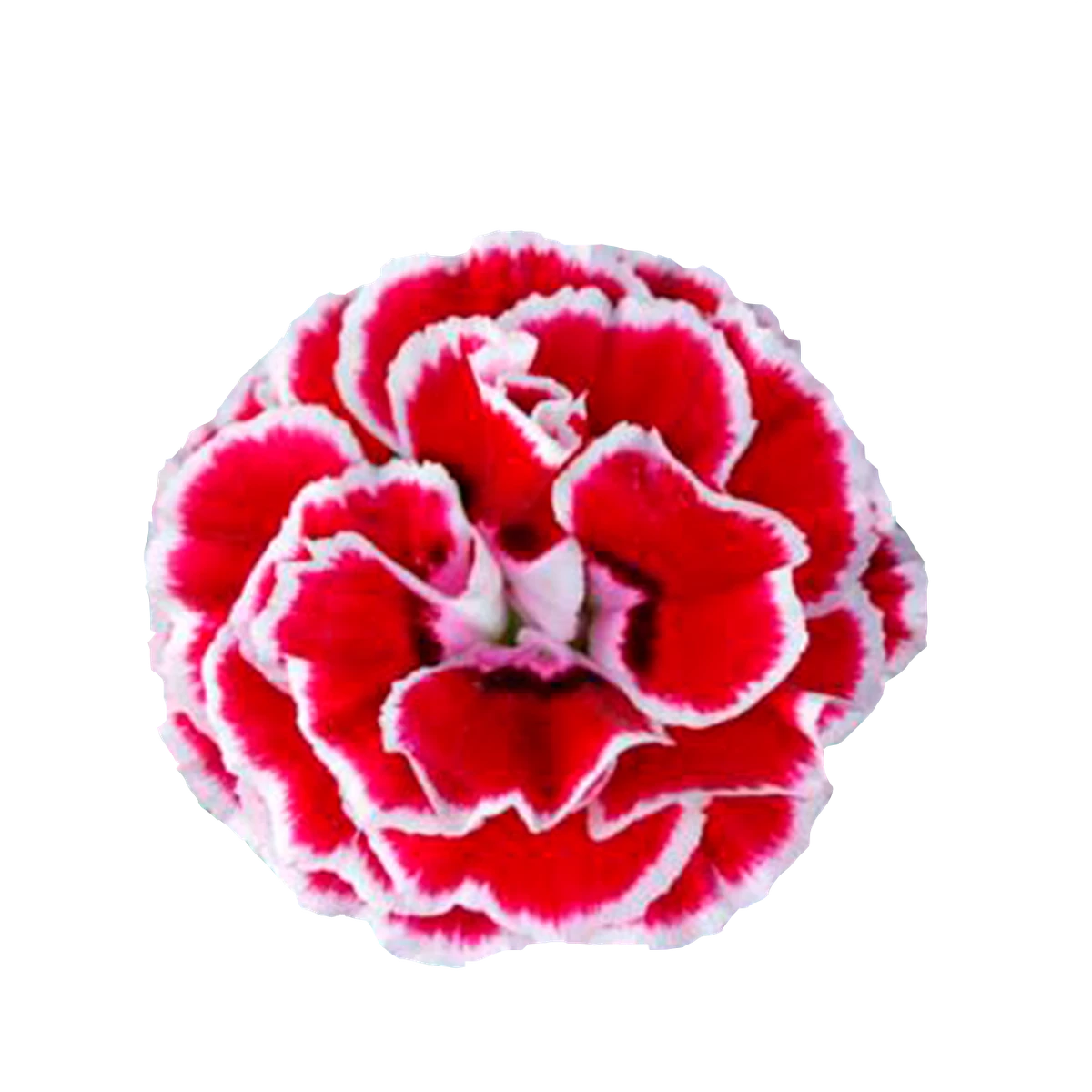
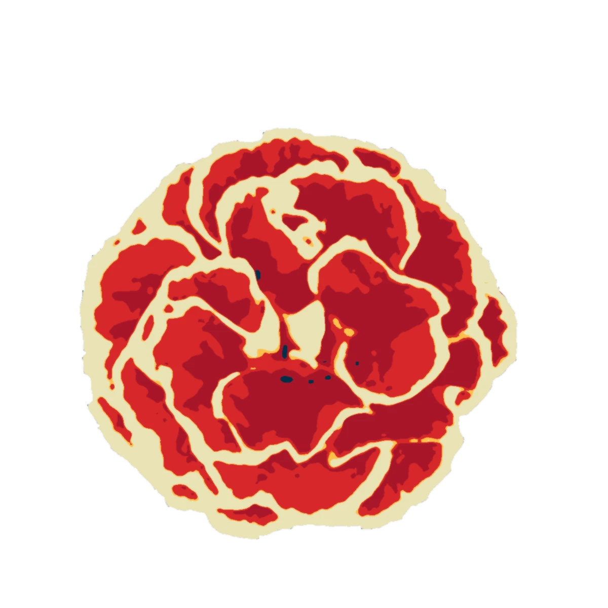
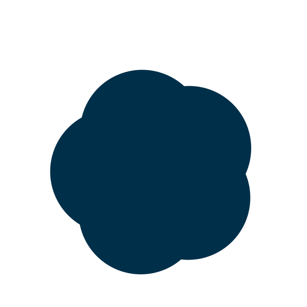
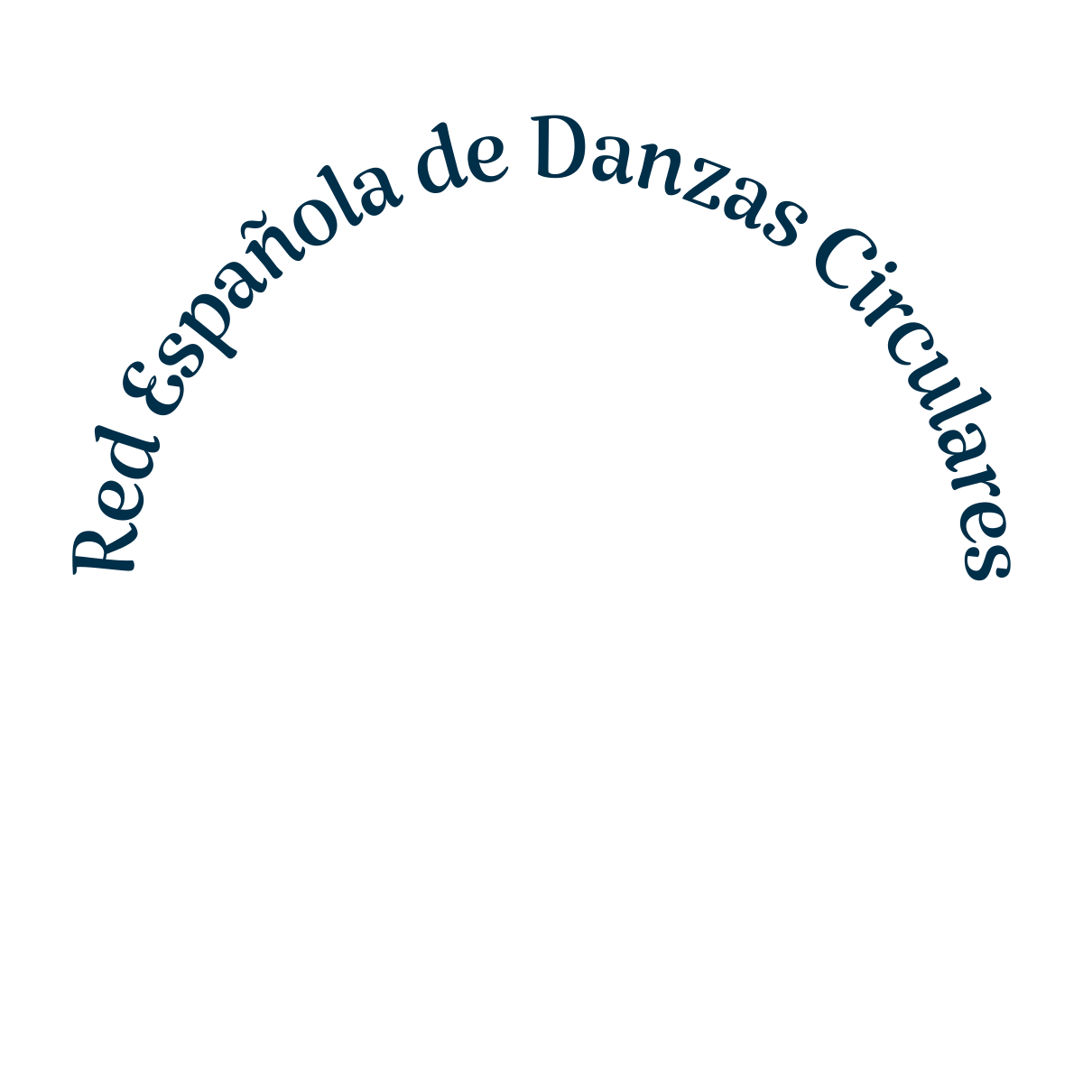
I swapped the people for a flower, the carnation, associated with Spain. The animation shows the path: the photo, the synthesis in the brand colours, the line drawing itself while turning like a ring, the colour opening from the spiral and the name.
- Photo
- Synthesis
- Line
- Colour
- Name
Circle and spiral
The petals turn towards a spiral centre: the dance. It stayed in colour and in a one-colour line version. The name surrounds the flower in an arc, in a calligraphic serif, so that the whole is another circle.
The festival, more direct
For “Directo al corazón” I made its own logotype, with artistic brush lettering and the o turned into a heart. It started in blue and ended in the red of the flower. A small line goes with it: “Festival de danzas circulares, primera edición”.
The system in use
A five-colour palette carried the brand to a brochure, an invitation email with the registration, social posts, a T-shirt and a phone mockup. It is all below, under Uses.
Versions


Uses
Specifications
- Navy blue
#002F49outline and name - Red
#D62729flower and festival - Orange
#F77F00 - Amber
#FDBF4Acentre - Cream
#E9E2B6background
- Typography
- Calligraphic serif in an arc for the network. Artistic brush lettering, with the heart o, for the festival.
- Colours
- Values taken from the delivered file.
Brands by Débora Malqui. The years are those of the work. Back to About me