Ziconex: one brand, one feed and an ad system for online therapy in Spanish
Ziconex offers online psychotherapy in Spanish for people living abroad. In three months I defined the product roadmap and built the brand, social media, Google and Meta ads and web visuals, as a single system.
Therapy in your language, from wherever you are
The audience is Spanish speakers who migrated and want to keep going to therapy, or start, with a professional who speaks their language. The product is a video session platform with a small team of psychologists and psychoanalysts. The job: make it feel like a safe place, explain how therapy works to someone who has never done it, and bring in the first clients with ads.
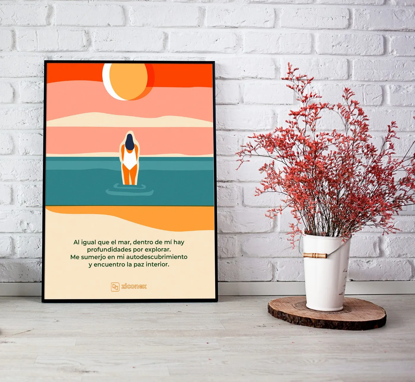
A mental health brand has to feel calm before it says anything. The green, the clouds and the illustrations do that job.
Roadmap first, then the brand
Before any artwork I wrote the roadmap and the product requirements, mapped the service in a concept map and kept everything in a Notion workspace the team could follow: value proposition, benchmark, inspiration and content calendar.

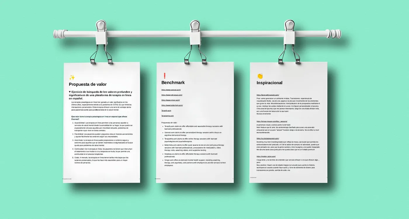
Swipe sideways or use the arrows. Tap a screenshot to enlarge it.
A green, safe space
Logo, color and an illustration style: a soft green, a rounded logotype and flat characters floating on clouds that carry the whole campaign, from the feed to the ads and the web.
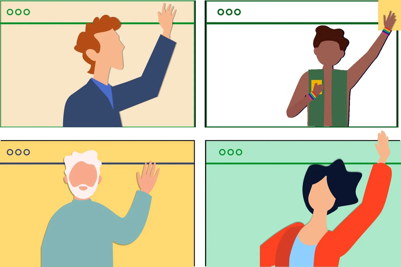
A 2023 trend: flat illustration, humanized
These illustrations follow a clear 2023 trend. It was born in tech companies as Corporate Memphis, or the Alegría style: flat people with simple shapes, exaggerated proportions and vivid colors. That year the style got warmer: soft textures, natural skin tones, small gestures and calm palettes. It worked for therapy because it shows real people talking on video without falling into stock-photo territory. That is why I used it across the whole system.
Explaining therapy, one post at a time
Instagram and Facebook as a place to teach: what psychoanalysis is, what a first session is like, the therapeutic path and the prices. Carousels, single posts, short animations and a consistent feed. Client reviews became quote posts.
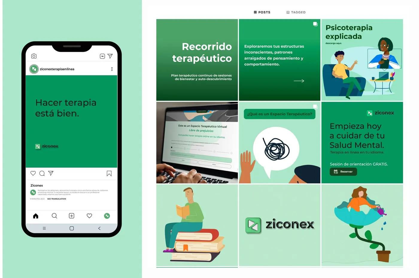
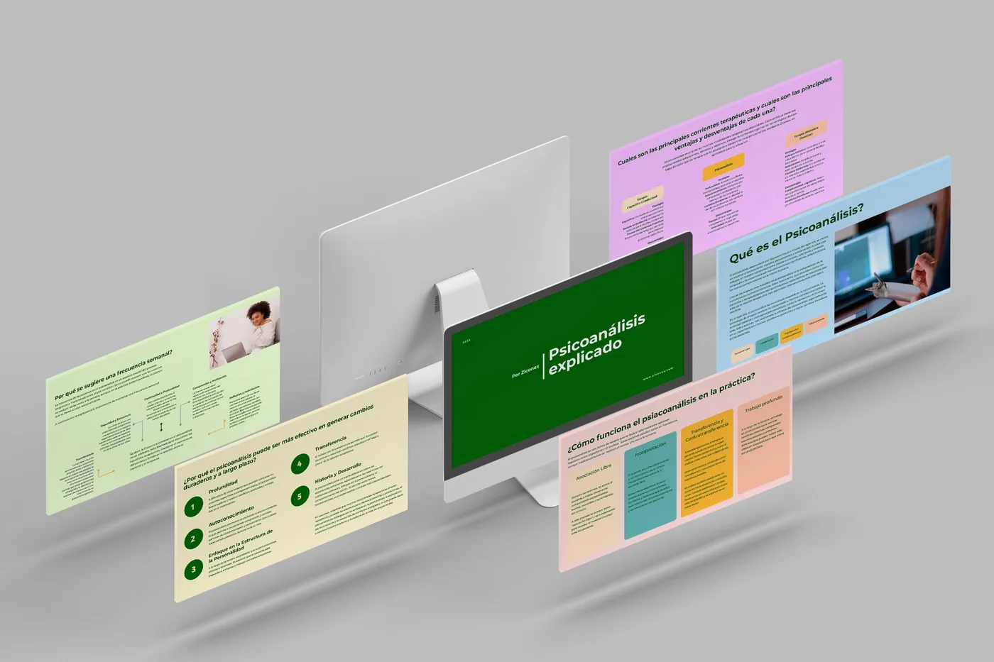
Swipe sideways or use the arrows. Tap a screenshot to enlarge it.

Google and social media ads on the same system
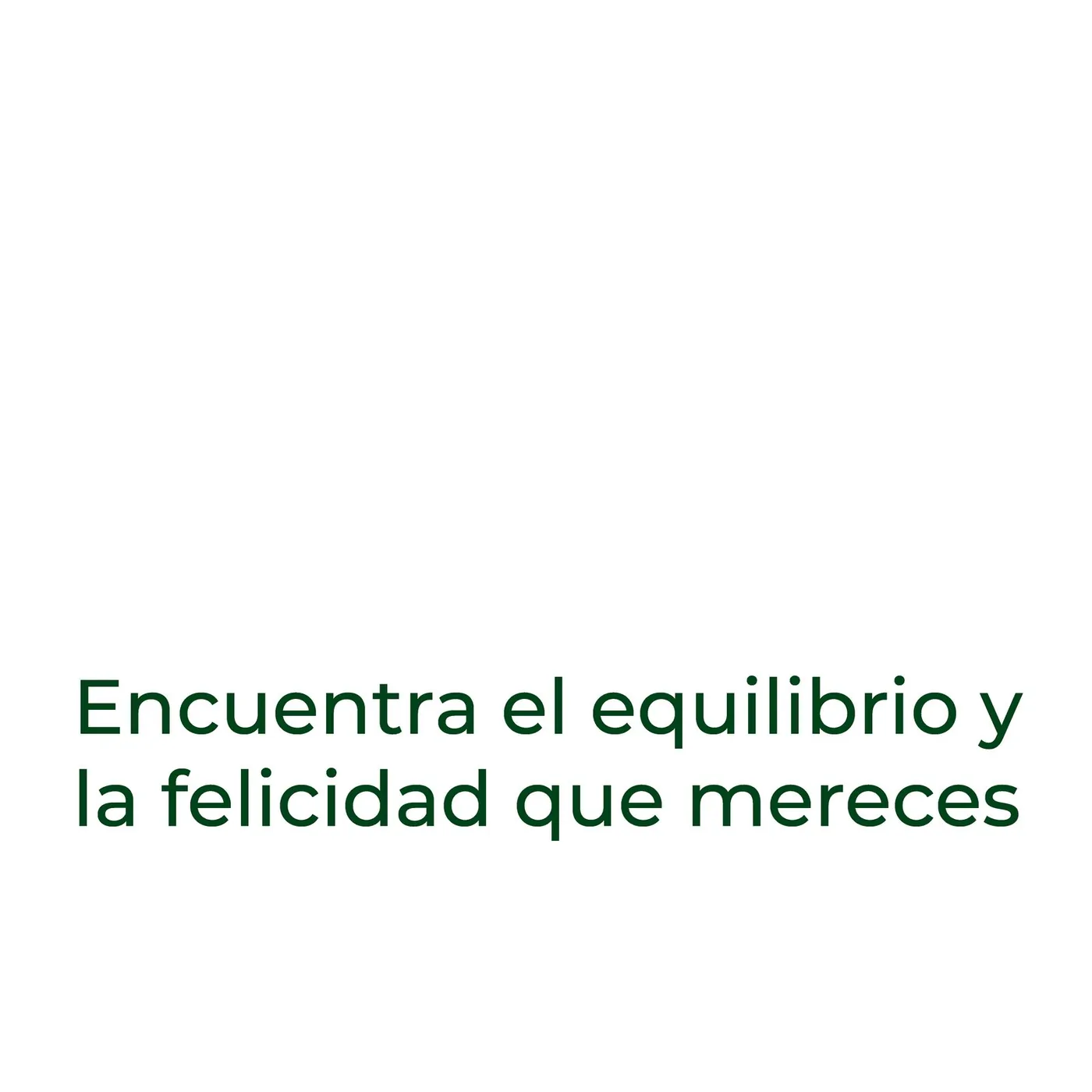
Display banners for Google Ads and Meta ad sets, built with the same illustrations and a single line, “Online therapy in your language”, with a second line for the benefit: “Find the balance and happiness you deserve”. Many sizes, one face.
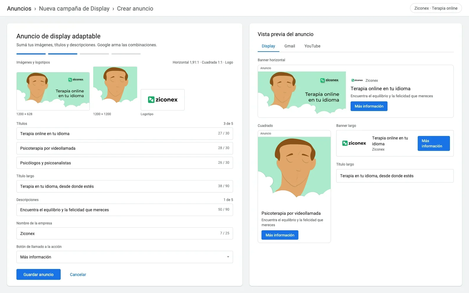
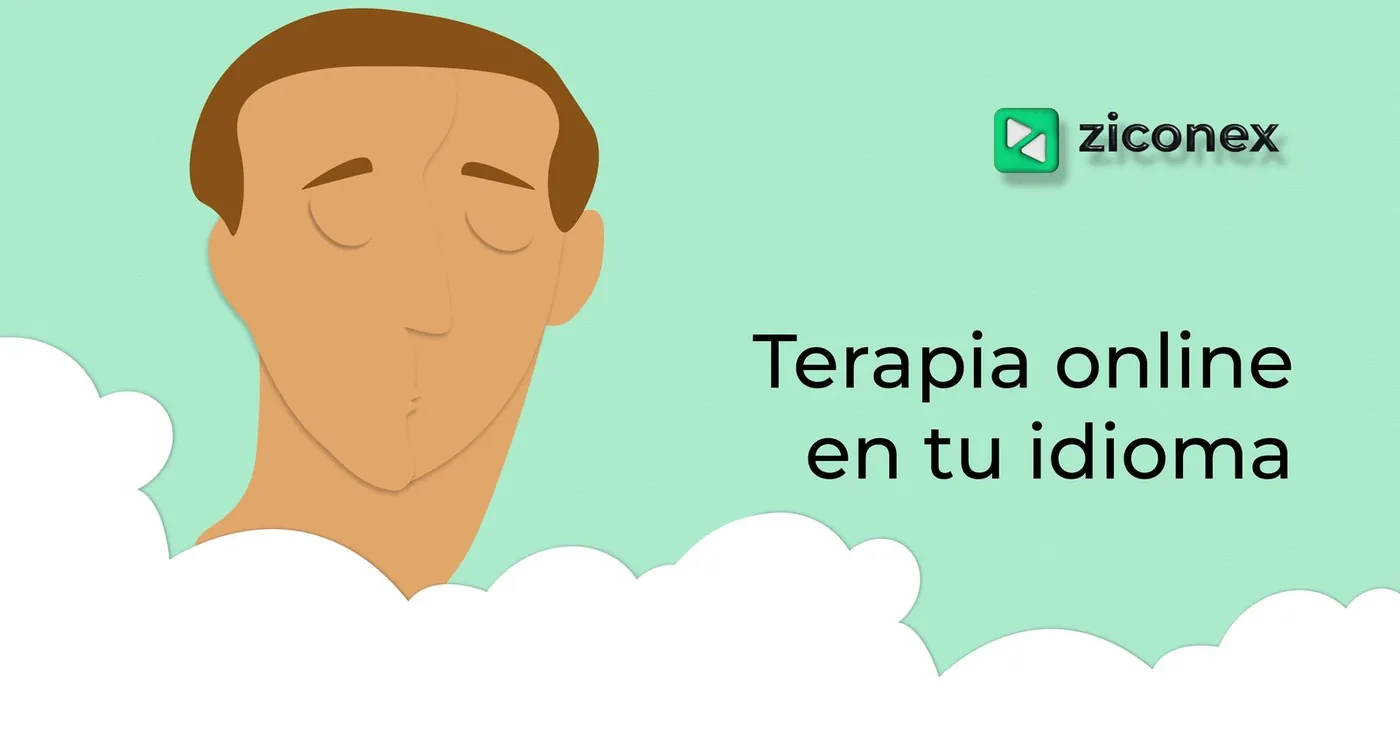
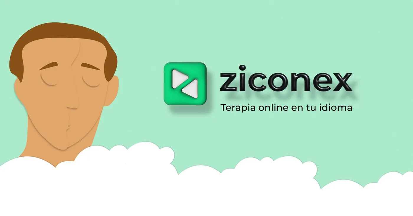
Hover or tap a piece to see what it is. Tap to enlarge.
What I took away
- Writing the roadmap first made every design decision easier to defend.
- A single illustration system covered brand, social media, ads and web, and with just three months of work the brand looked consistent.